I have often said, of my day gig in advertising, “If this job is ever difficult, it’s because somebody screwed up.” You might think that’s pretty upbeat coming from me until you realize that only one screw-up has to be signed off on to make an entire campaign, or even a brand, difficult. And sometimes one screw-up is made up of a bunch of tiny, intricate, co-dependent screw-ups. Conversely, one screw-up that happened years ago can continue to resonate in work I have yet to complete. You get it. It’s like that old chaos theory chestnut.
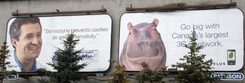
I haven’t worked on either of these brands so I can only guess at what made these ads into a punchline. Many will immediately blame a failure of creative imagination; others might blame the media buyer. My theory is that the guidelines for the brand on the left were cooked up south of the border, and then applied rigorously in a market where a strong local brand presence had already been using the same layout and font for years. The rest is a foregone conclusion. It was practically fate that these two billboards would meet sooner or later.
That’s not to say we couldn’t pick at the execution if we were being churlish. Yeah, that Sensodyne billboard reads like a brief, but that’s pharma for you, for the most part, particularly in a medium where you have fewer than 10 words to get your point across. And I’m sure it’s not the first (or best) headline the creative team came up with. I also imagine this conversation happening somewhere between the creative presentation and final sign-off:
CLIENT: It has to be clear that the person making the statement is an expert. Ideally a dentist.
CREATIVE TEAM: Well, he is wearing a white coat and talking about toothpaste.
CLIENT: I don’t think it’s obvious enough. He could be an OB/GYN. Or a veterinarian.(If you can’t make out how that particular issue was resolved, click on the image for a closer look.)
My sympathy is not reserved solely for the Sensodyne team. I don’t think making the hippo board would have been that much more fun. The look of Telus ads hasn’t changed appreciably in over 10 years: Creature, check. White background, check. Helvetica Neue, check. Sure, you get to work with a nice clean layout and cute animals. Imagine if writing lolcats was your job! But try having the same thing for lunch every day for a couple of weeks and get back to me. Oh and I almost forgot to mention, try something else for lunch and you’re fired.
I have to thank my wife, who has a keen eye for the absurd, as well as for hippos, for pointing this rather awkward juxtaposition out to me (and photographing it). She also suggested a slight improvement to the Telus billboard, and I have obliged; results are here.


Oh, now I see! It’s a hippo. Good improvement!